The Power Of Responsive Web Design For Mobile Devices - Webmasters - Nairaland
Nairaland Forum / Science/Technology / Webmasters / The Power Of Responsive Web Design For Mobile Devices (390 Views)
What Is Responsive Web Design? / Benefits Of Responsive Website Design To Your Business / Is Responsive Web Design Finally Dying? (2) (3) (4)
(1) (Reply)
| The Power Of Responsive Web Design For Mobile Devices by Maniflex(m): 4:50pm On Mar 24, 2023 |
In today's world, more people are accessing the internet through their mobile devices than ever before. This means that businesses need to adapt their websites to be mobile-friendly. One of the key ways to achieve this is by implementing a responsive design. In this article, we will discuss the importance of responsive design for mobile devices and how it can benefit your business. Maniflex Ltd is one of the top web design agencies, that can help you with making your website mobile response, and boost your search engine rankings. What is Responsive Design? 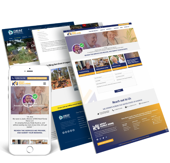 Responsive design is a web design approach that aims to provide an optimal viewing experience across different devices. This means that your website will adapt to the screen size of the device it is being viewed on, whether it is a desktop computer, tablet, or mobile phone. A responsive design ensures that your website's content is easy to read and navigate, regardless of the device being used. It also ensures that your website loads quickly and efficiently on mobile devices, which is essential for retaining visitors and keeping them engaged with your content. Why is Responsive Design Important for Mobile Devices? 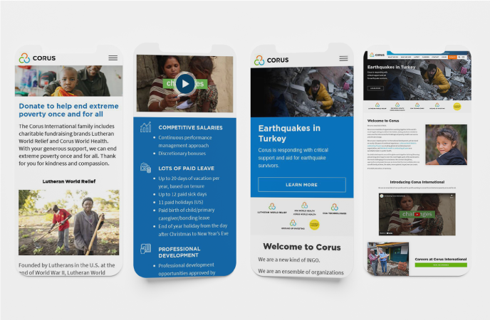 Responsive design is crucial for mobile devices because mobile traffic has now surpassed desktop traffic. According to a study conducted by StatCounter, mobile devices accounted for 55.73% of internet usage worldwide in 2020, compared to 43.46% for desktop devices. This trend is expected to continue in the coming years, which means that having a mobile-friendly website is no longer an option but a necessity. Here are some of the key reasons why responsive design is important for mobile devices: Better User Experience A responsive design ensures that your website looks great and functions well on any device. This means that users will have a positive experience when they visit your site, regardless of whether they are using a desktop computer, tablet, or mobile phone. When users have a good experience on your website, they are more likely to stay longer, engage with your content, and take the desired action, such as making a purchase or filling out a contact form. On the other hand, if your website is not mobile-friendly, users are likely to become frustrated and leave your site, which can result in a high bounce rate. Improved Search Engine Optimization (SEO) Search engines, such as Google, prioritize mobile-friendly websites in their search results. This means that if your website is not mobile-friendly, it may not rank as high in search results as your competitors who have mobile-friendly sites. Having a responsive design can improve your website's SEO by ensuring that your site is easily accessible and navigable on any device. It also helps to reduce your website's load time, which is another factor that search engines take into account when ranking websites. Increased Mobile Traffic As we mentioned earlier, mobile traffic has now surpassed desktop traffic. This means that if your website is not optimized for mobile devices, you could be missing out on a significant amount of traffic and potential customers. Having a responsive design ensures that your website is accessible and user-friendly on any device, which can help to increase mobile traffic to your site. This, in turn, can help to increase your leads, conversions, and revenue. Cost-Effective Solution Having a separate mobile website can be expensive to create and maintain. It also requires additional resources to optimize for different devices and screen sizes. On the other hand, implementing a responsive design is a cost-effective solution that ensures your website is optimized for all devices without the need for a separate mobile site. By implementing a responsive design, you can save time and money on website maintenance and updates, as you only need to make changes once to ensure they are applied across all devices. Future-Proof Your Website As technology continues to evolve, new devices with different screen sizes and resolutions will continue to emerge. By implementing a responsive design, you future-proof your website by ensuring that it is adaptable to any new device that is released. This means that you don't have to worry about constantly updating your website to keep up with the latest technology trends. Instead, you can rest assured that your website will always look great and function well, regardless of the device it is being viewed on. How to Implement Responsive Design Implementing a responsive design requires careful planning and attention to detail. Here are some key steps to follow: Choose a Responsive Design Framework There are many responsive design frameworks available that can help you to quickly and easily implement a mobile-friendly design for your website. Some popular frameworks include Bootstrap, Foundation, and Materialize. These frameworks provide pre-built HTML, CSS, and JavaScript components that you can use to create a responsive design for your website. They also provide responsive design templates that you can customize to suit your needs. Use Flexible Grids and Images One of the key elements of responsive design is the use of flexible grids and images. This means that instead of using fixed widths for elements on your website, you use percentages or other flexible units that can adapt to different screen sizes. For example, instead of setting a fixed width of 1000 pixels for your website's content area, you would use a percentage-based width that adjusts based on the size of the screen. This ensures that your website's content is always displayed in a way that is easy to read and navigate, regardless of the device being used. Similarly, you should use images that can scale to different sizes without losing their quality or becoming distorted. This can be achieved by using CSS to set a maximum width for images and allowing them to scale down proportionally as the screen size decreases. Test Your Design on Different Devices Once you have implemented a responsive design for your website, it's important to test it on different devices to ensure that it looks and functions well on each one. You can use tools such as Google's Mobile-Friendly Test to check how your website appears on different devices and to identify any issues that need to be addressed. Testing your website on different devices also allows you to identify any performance issues, such as slow loading times, that may be affecting your users' experience. You can use tools such as Google's PageSpeed Insights to identify areas where you can improve your website's performance. Conclusion 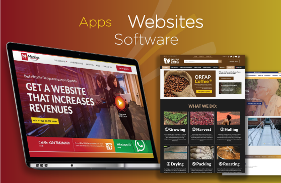 Responsive design is essential for businesses that want to provide a great user experience for their customers on mobile devices. With mobile traffic surpassing desktop traffic, having a mobile-friendly website is no longer an option but a necessity. By implementing a responsive design, you can ensure that your website looks and functions well on any device, improves your website's SEO, increases mobile traffic, and future-proofs your website. It's a cost-effective solution that can save you time and money in the long run. If you haven't already implemented a responsive design for your website, now is the time to do so. With more people accessing the internet through their mobile devices than ever before, a responsive design is essential for staying competitive in today's digital landscape. |
| Re: The Power Of Responsive Web Design For Mobile Devices by swanpiccolo: 11:57am On Mar 27, 2023 |
Great read, thanks for sharing! |
(1) (Reply)
Send Free Sms In Nigeria / Please,nexxy007 Send Me Paypal Tutorial / I Think I Can Help Thus Who Want To Learn How To Hack And Spam, Call: 0816973979
(Go Up)
| Sections: politics (1) business autos (1) jobs (1) career education (1) romance computers phones travel sports fashion health religion celebs tv-movies music-radio literature webmasters programming techmarket Links: (1) (2) (3) (4) (5) (6) (7) (8) (9) (10) Nairaland - Copyright © 2005 - 2024 Oluwaseun Osewa. All rights reserved. See How To Advertise. 28 |